Our Focus Group
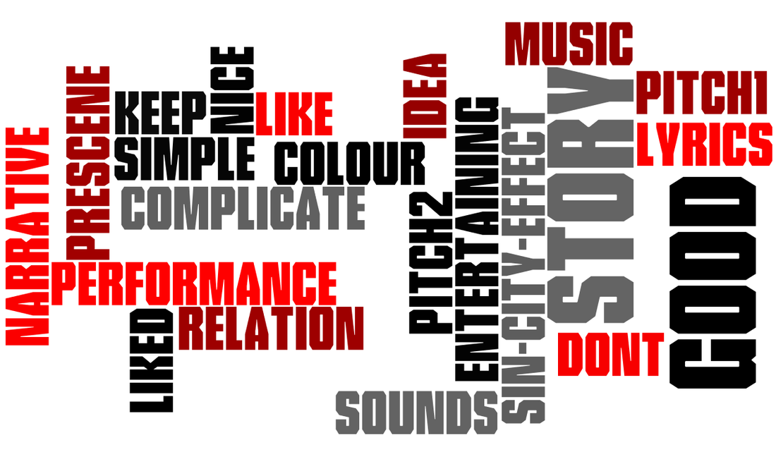
Above we used 'Wordle' to create an image which highlights some of the important words which were prominent in our focus groups, audience feedback and discussions.
|
|
|
Audience Feed Back
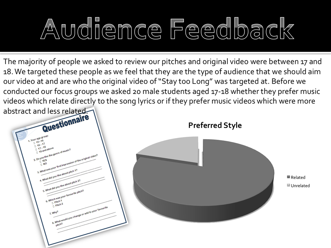
Questionnaire Feedback
|
Firstly we did a small focus group, presenting all three of our pitches. Their feed back was quite positive but as a result we decided to cut out our second pitch because it was too similar to the first one and was too vague and unrelated according to our focus group.
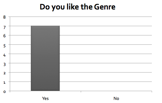
We then gave them questionnaires and the results are as follows. 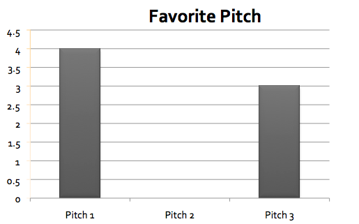
|
From the data on the first graph, we concluded that because pitch 2 was the least popular we would cut it out and the present the 2 remaining pitches to another focus group to get their opinions on the other two. This would give us greater insight into their opinions of our possible videos and help generate useful constructive feedback.
|
Focus Group Feedback
The majority of people in our focus groups also preferred the first pitch because it related more to the lyrics and therefore had visual correlation which made it more authentic and made the song more visual. However there were some positive views about the third pitch as it relates more to the meaning of the song “Stay too Long” rather than actually following the lyrics. But they also thought that it might be fairly boring as there isn’t much potential in one scene, also they thought that it doesn’t offer much variety or excitement.
From the feedback we also gathered that the audience liked the idea of the pre-song scene as it would help to set up the video and offer a base for the story making it stronger and more realistic. Also generally people thought that colour correction would be a good idea, perhaps making it sepia tone or greyscale. They thought that this could help to set a mood or theme. Another idea was to do a ‘Sin City’ effect to keep just a red tie and hanky as this would look quite stylised and add an intersexual reference.
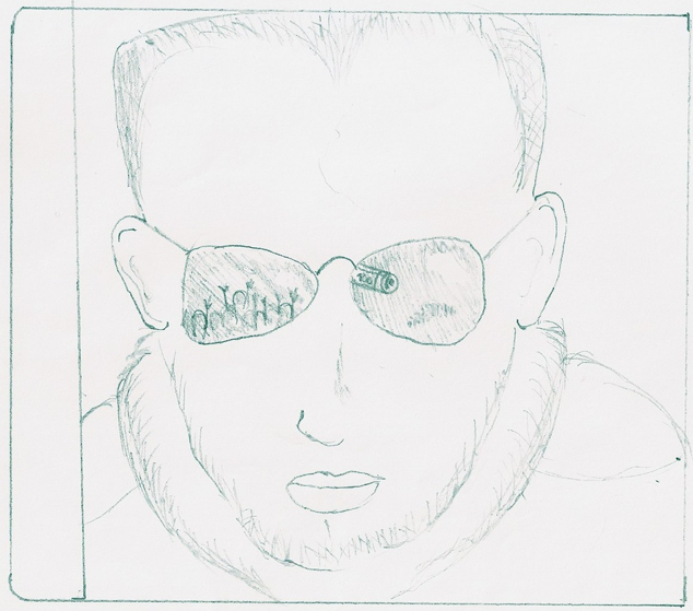
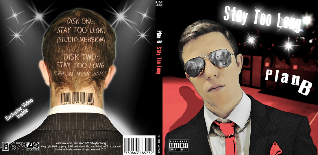
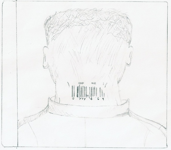
We Also used audience feedback to help us with our ancillary texts and gain a perspective of what our audience did and didn't like in terms of the art work for the digipack and the magazine advert. One of the elements which our focus group liked from the front cover was the reflection in Plan B's sunglasses. They also liked the idea of the barcode on his neck for the back cover as it can connote to commercialism and ads a stylistic edge. As a result of the feedback we were able to eliminate some of our less popular designs and combine some elements of different designs to create our final digipack which can be seen on the Ancillary Texts page.
From the feedback we also gathered that the audience liked the idea of the pre-song scene as it would help to set up the video and offer a base for the story making it stronger and more realistic. Also generally people thought that colour correction would be a good idea, perhaps making it sepia tone or greyscale. They thought that this could help to set a mood or theme. Another idea was to do a ‘Sin City’ effect to keep just a red tie and hanky as this would look quite stylised and add an intersexual reference.
We Also used audience feedback to help us with our ancillary texts and gain a perspective of what our audience did and didn't like in terms of the art work for the digipack and the magazine advert. One of the elements which our focus group liked from the front cover was the reflection in Plan B's sunglasses. They also liked the idea of the barcode on his neck for the back cover as it can connote to commercialism and ads a stylistic edge. As a result of the feedback we were able to eliminate some of our less popular designs and combine some elements of different designs to create our final digipack which can be seen on the Ancillary Texts page.
|
|
|
